Location
Jaipur, India
Duration
2 Weeks
Tools Used
Figma, Miro, Sketchup-3D Model, Pen & Paper, Accessibility Guidelines
Key Focus Area
Inclusive UI, Accessible Physical-Digital Systems, Simplified Task Flow, Multi-sensory Feedback
Target Audience
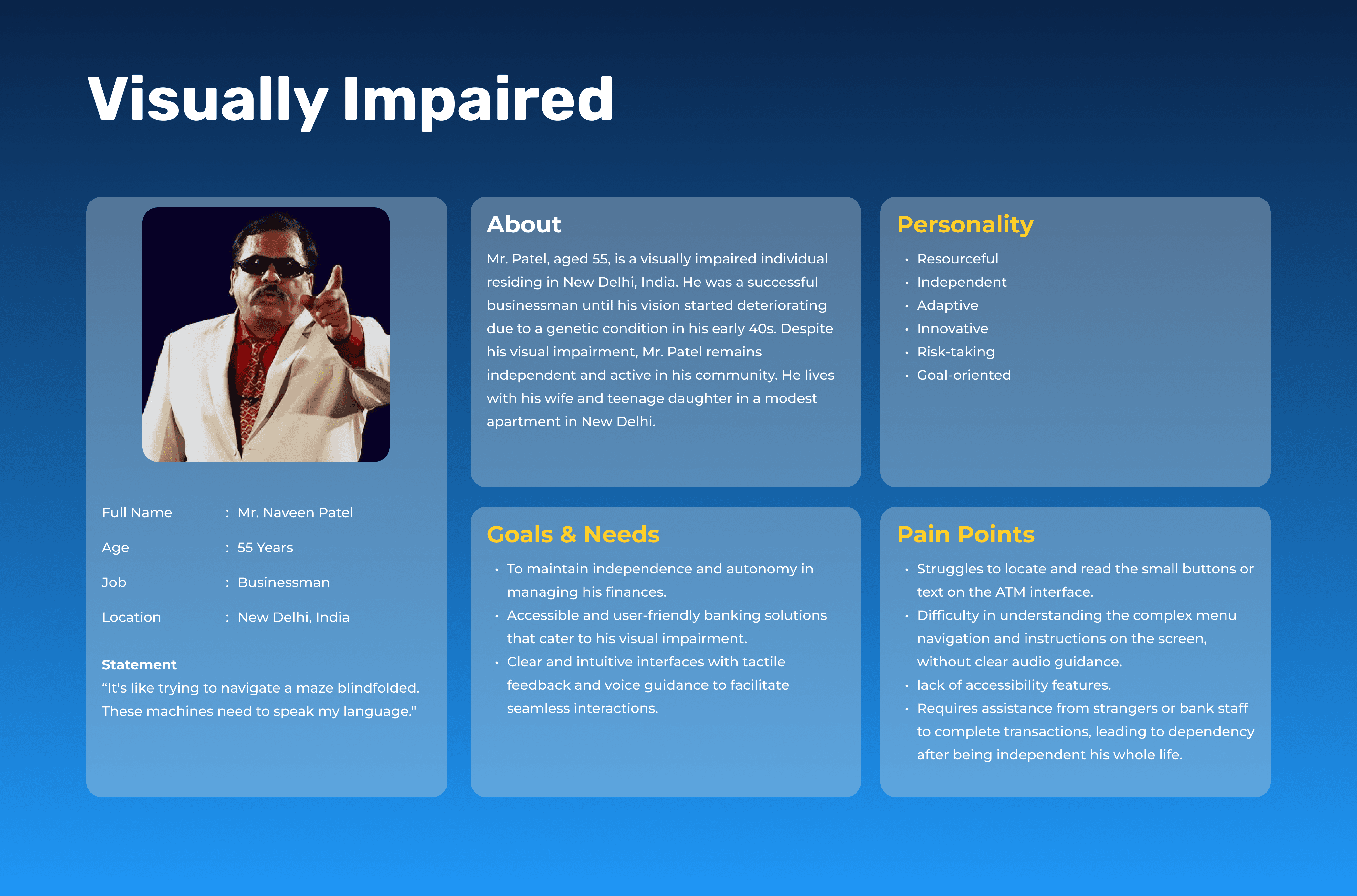
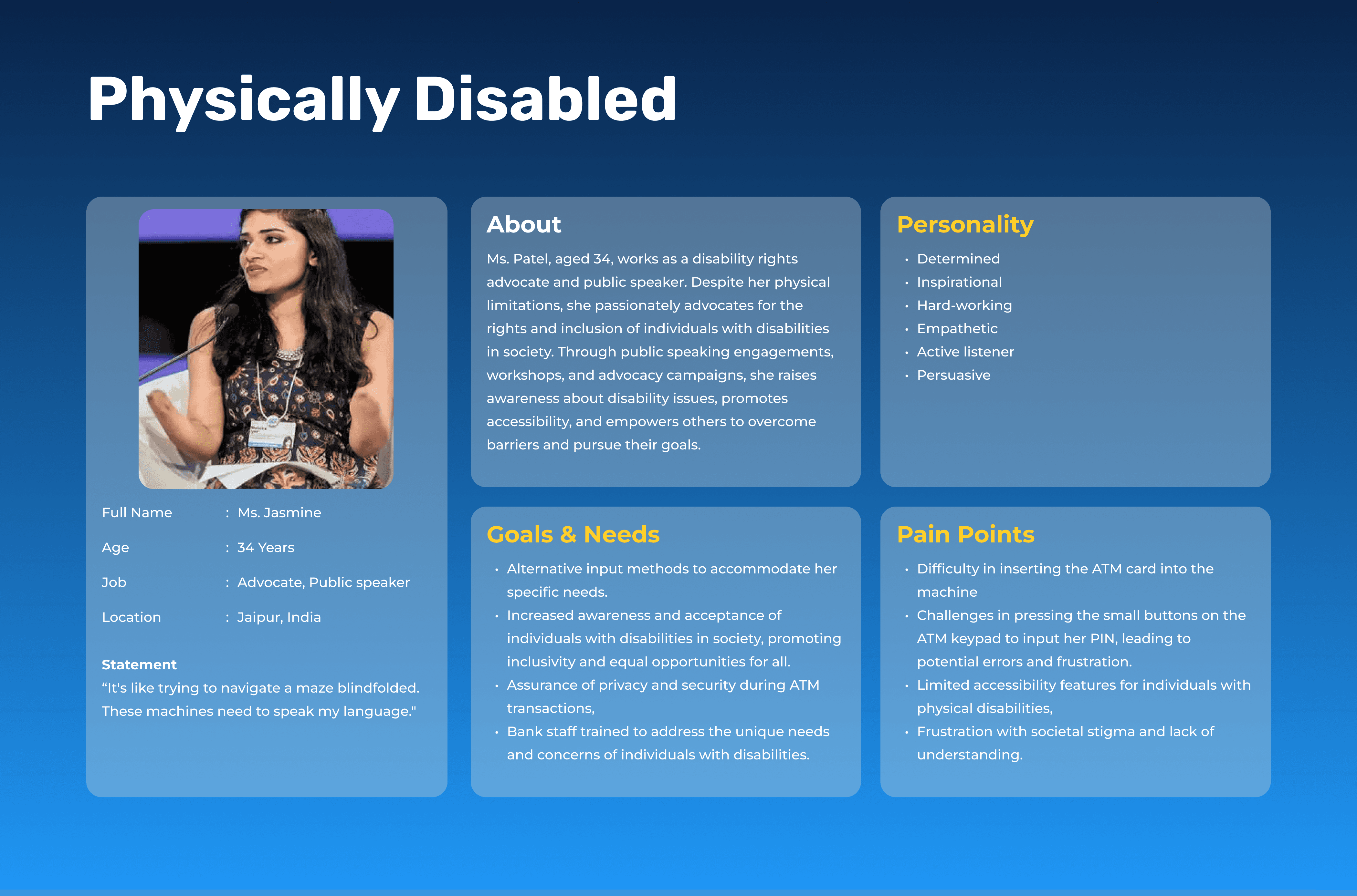
Elderly, visually impaired, and physically disabled users
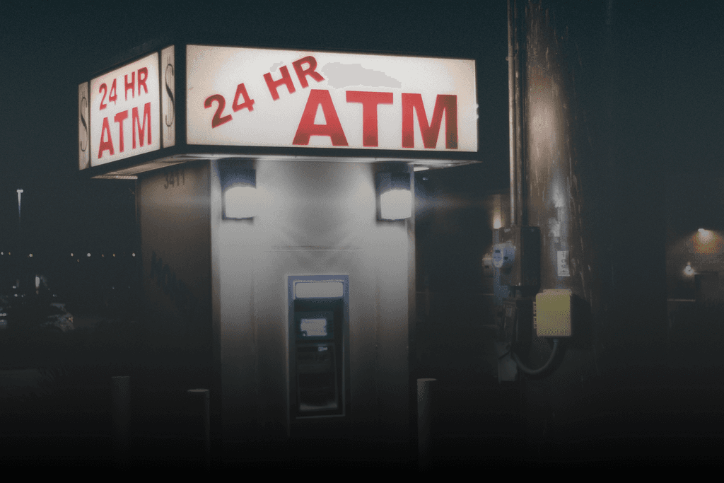
PROBLEM STATEMENT
ATM interfaces in India often fail to support the independent use of elderly individuals (45–60+), visually impaired users, and people with physical disabilities. Cluttered screens, unclear feedback, and poor accessibility features make even basic transactions difficult — forcing many users to rely on others for help.
This lack of inclusion compromises not just usability, but also financial autonomy and privacy — highlighting an urgent need for a system that empowers all users through thoughtful, accessible design.
DESIGN PROCESS

RESEARCH & INSIGHTS
To understand ATM usage from an accessibility lens, I adopted a combination of observational research, simulation testing, and expert accessibility reviews.
Observational & Simulated Research
I visited multiple ATM kiosks in Jaipur, focusing on both interface and physical access issues. I also simulated user experiences with the help of peers:
One participant was blindfolded to mimic the challenges of visual impairment.
Another had to operate the ATM using only their elbows, replicating the constraints of limited hand mobility.
I conducted real interactions with elderly users, observing their navigation, hesitation, and assistance needs.
This allowed me to uncover not just interface pain points, but also emotional and ergonomic friction.
Key Insights by User Group
🧓 Elderly Users (46+) | 🧑🦯 Visually Impaired Users | 🧑🦼 Physically Disabled Users |
|---|---|---|
Struggled with small text, lack of guidance, and overwhelming menu options. | Voice feedback was inconsistent or inaudible due to outdoor noise. | No alternative interaction options (e.g. voice commands or assistive tech support). |
Trembling hands and slower response times made timed tasks stressful. | Engraved keys weren’t tactile enough; no Braille or auditory prompts for navigation. | Fixed screen height and inaccessible design made interaction almost impossible. |
Found it hard to reach card slots and buttons in some ATMs. | UI lacked contrast and clarity, making screen content unreadable. | Relied on others, compromising privacy and autonomy. |
Expressed fear of error and dependency on others to complete transactions. | Felt excluded from independent financial interactions. |
👥 General User Insights by Age Group
18–25: Prioritized fast, usable functionality.
26–35: Wanted fewer distractions (ads) and faster task completion.
36–45: Noted inconsistent flows and increasing complexity.
46+: Requested larger text, clearer instructions, and better lighting.
Accessibility Standards Referenced
I reviewed design guidelines including:
WCAG (Web Content Accessibility Guidelines)
RBI’s Guidelines for Accessible ATMs
Global benchmarks for universal and inclusive design
This gave structure to the solution, ensuring it aligned not just with user empathy, but with compliance and global best practices.
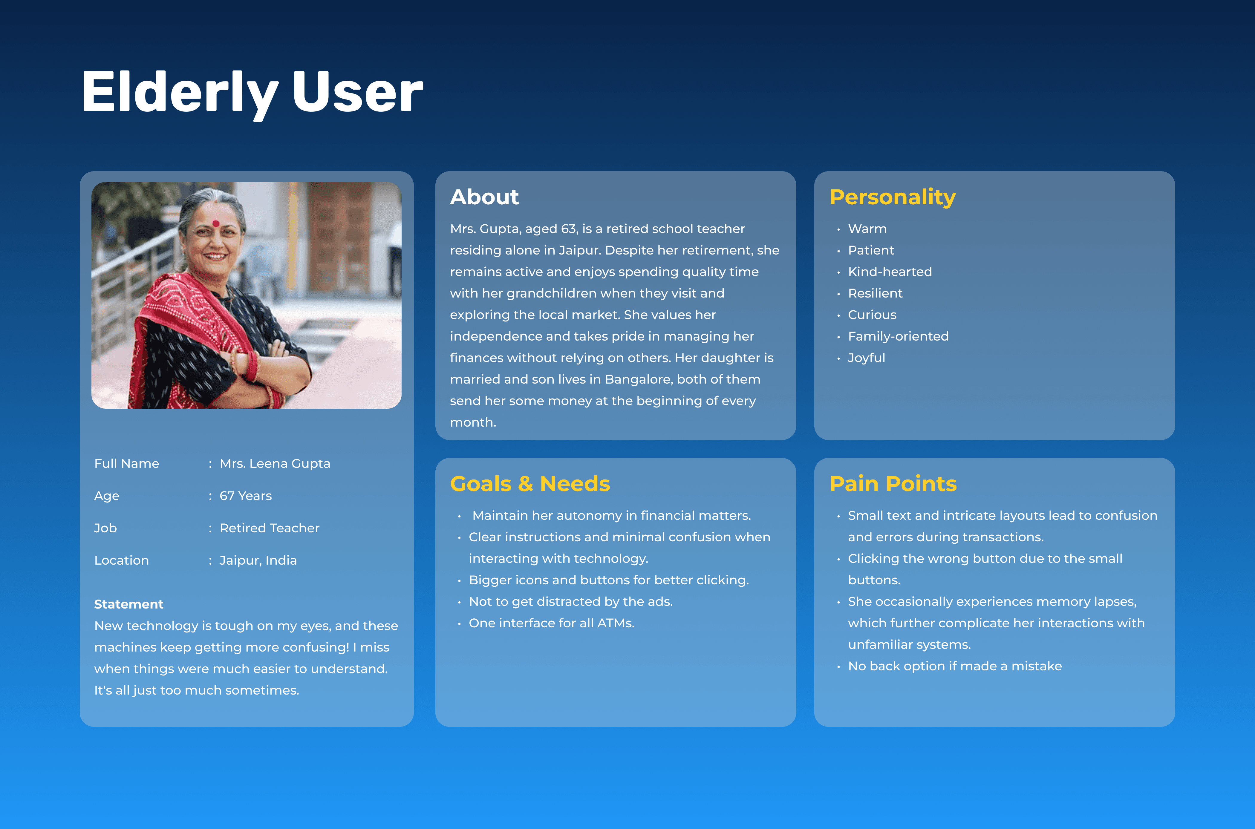
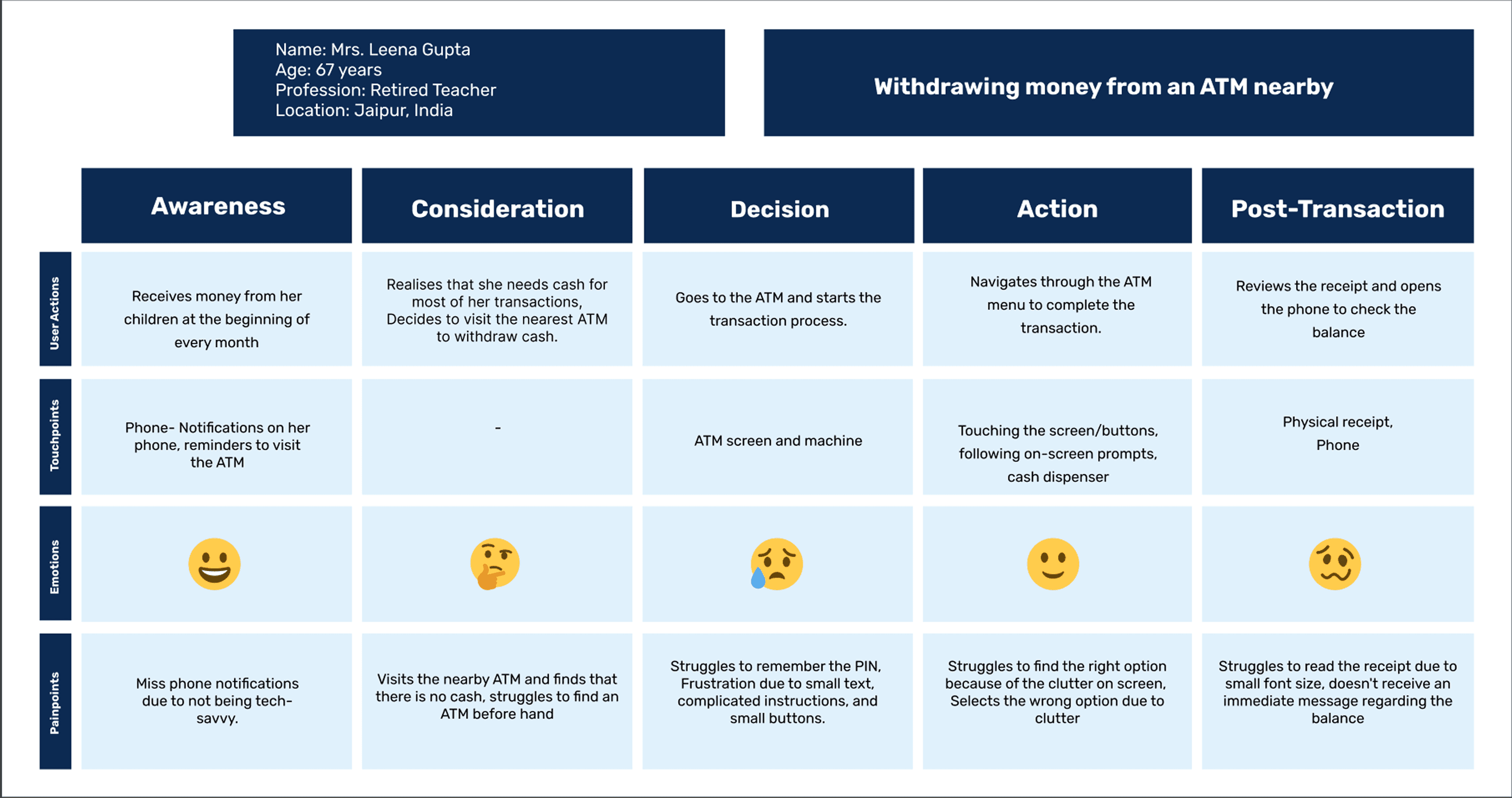
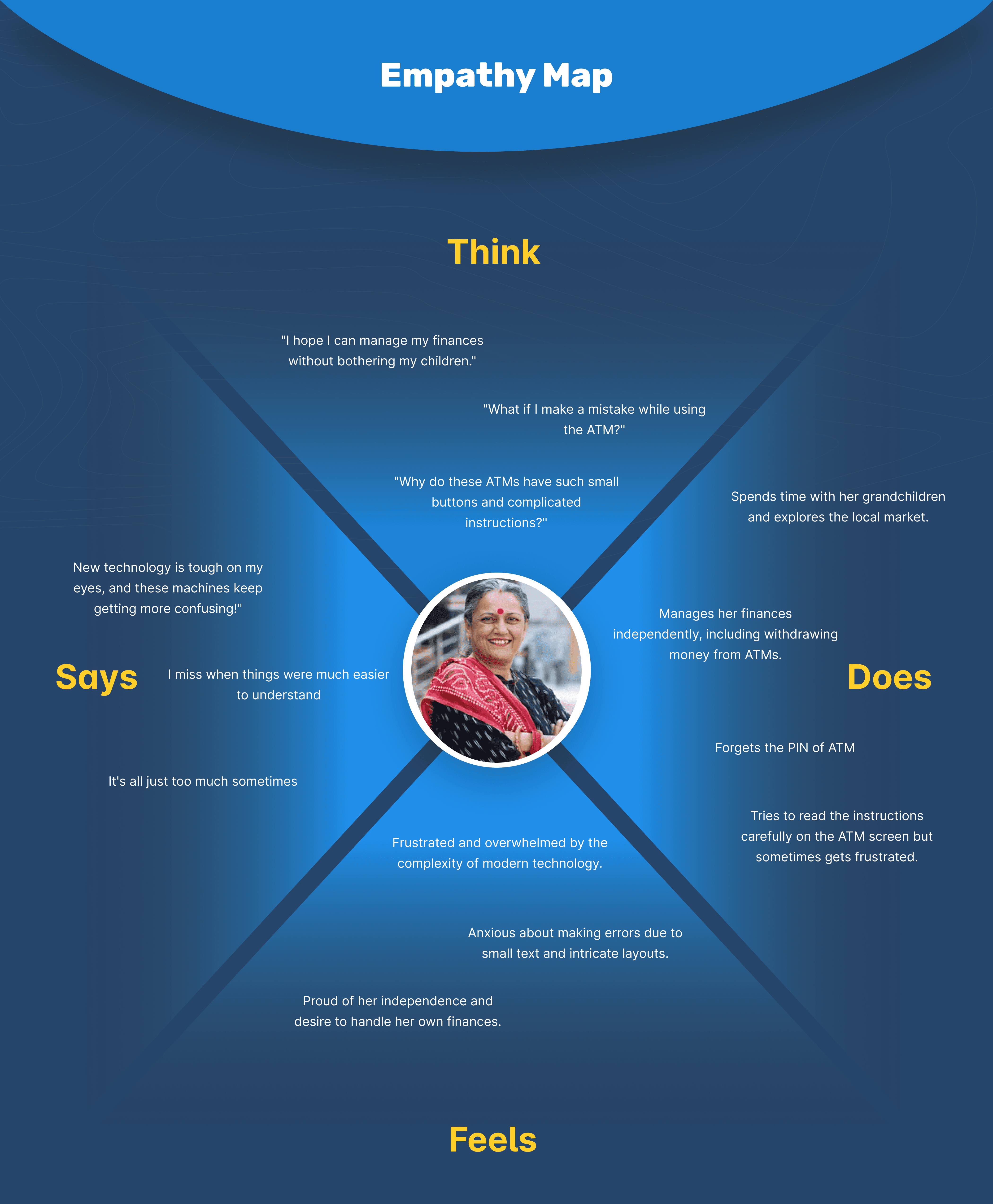
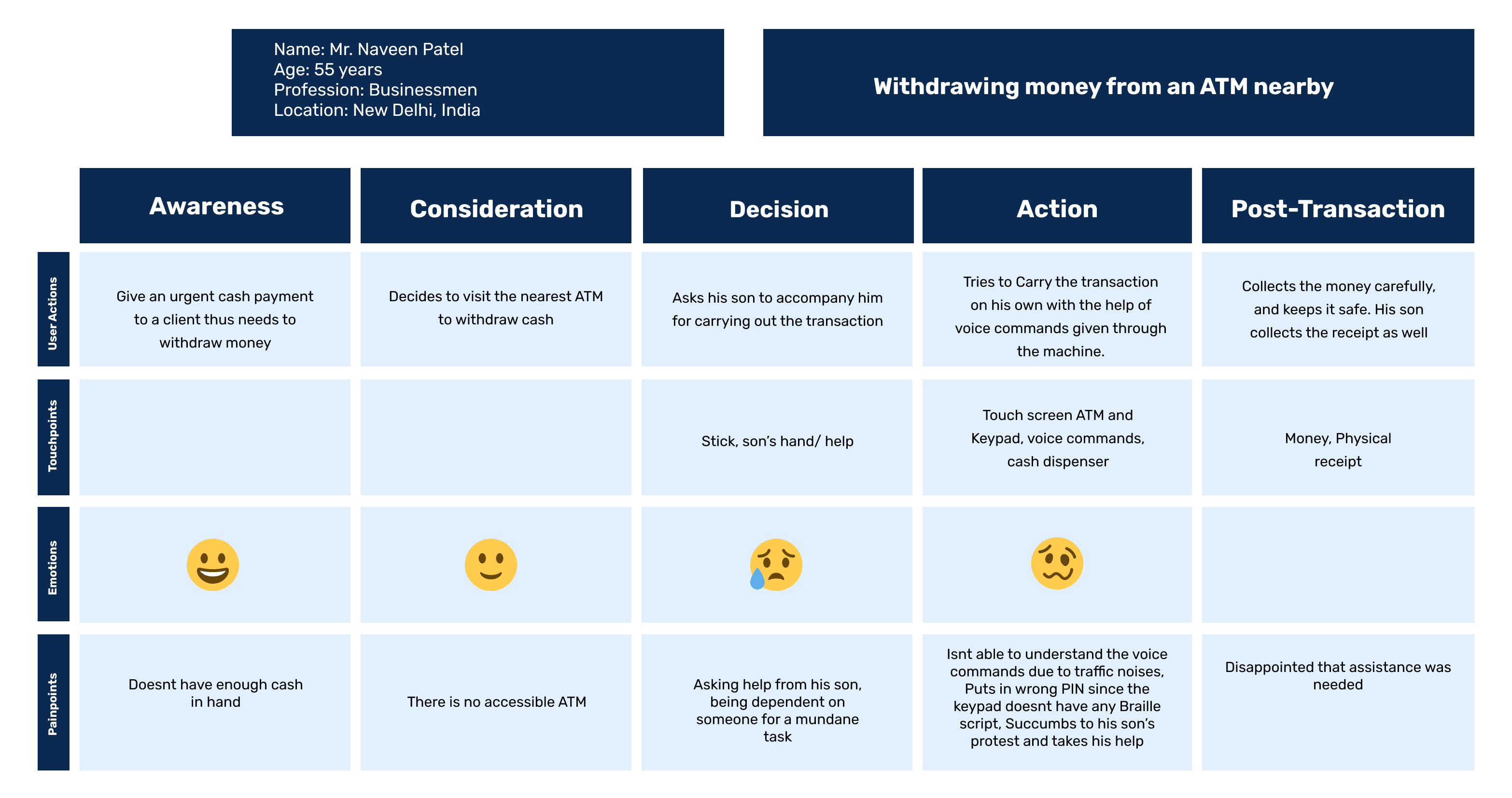
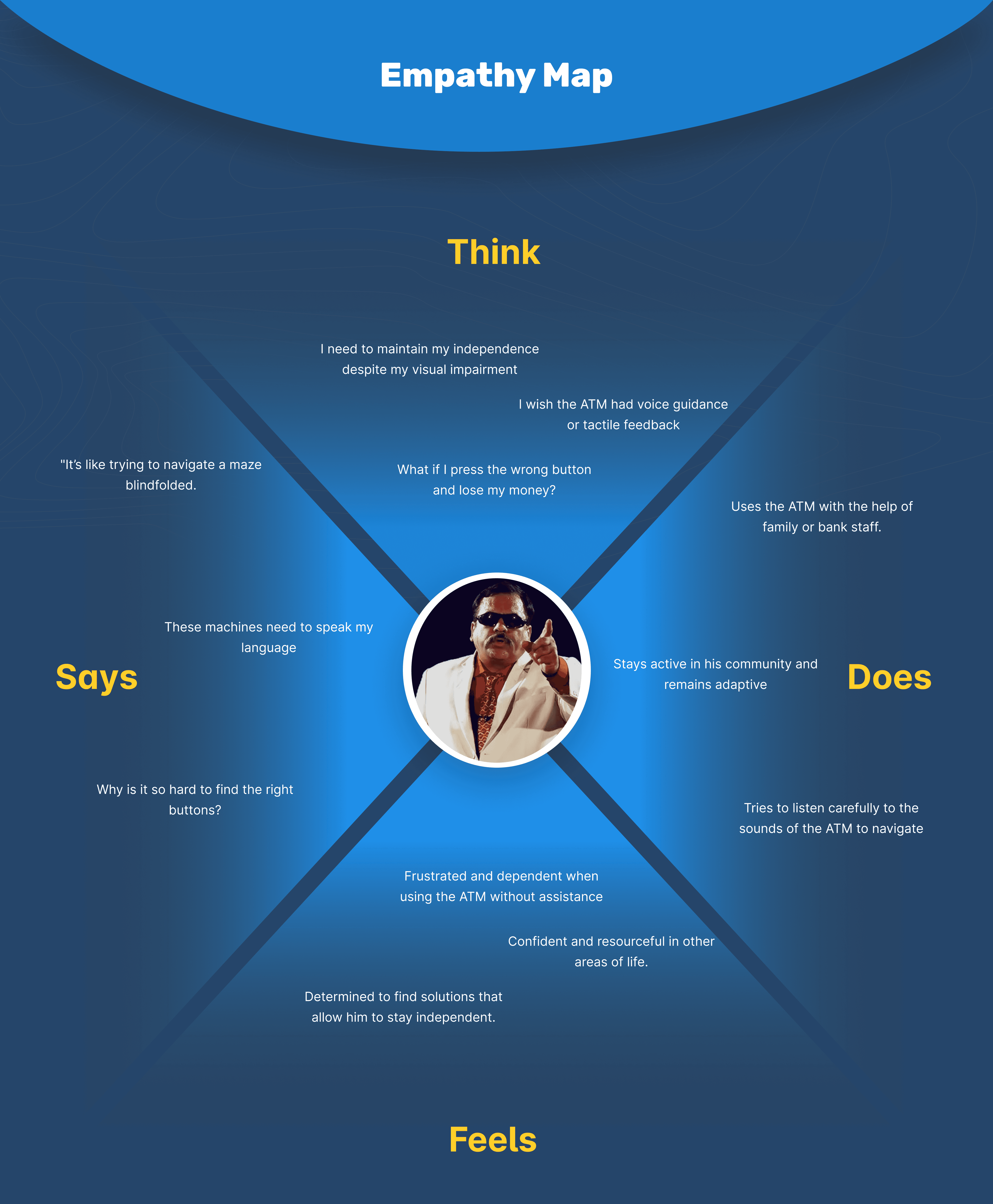
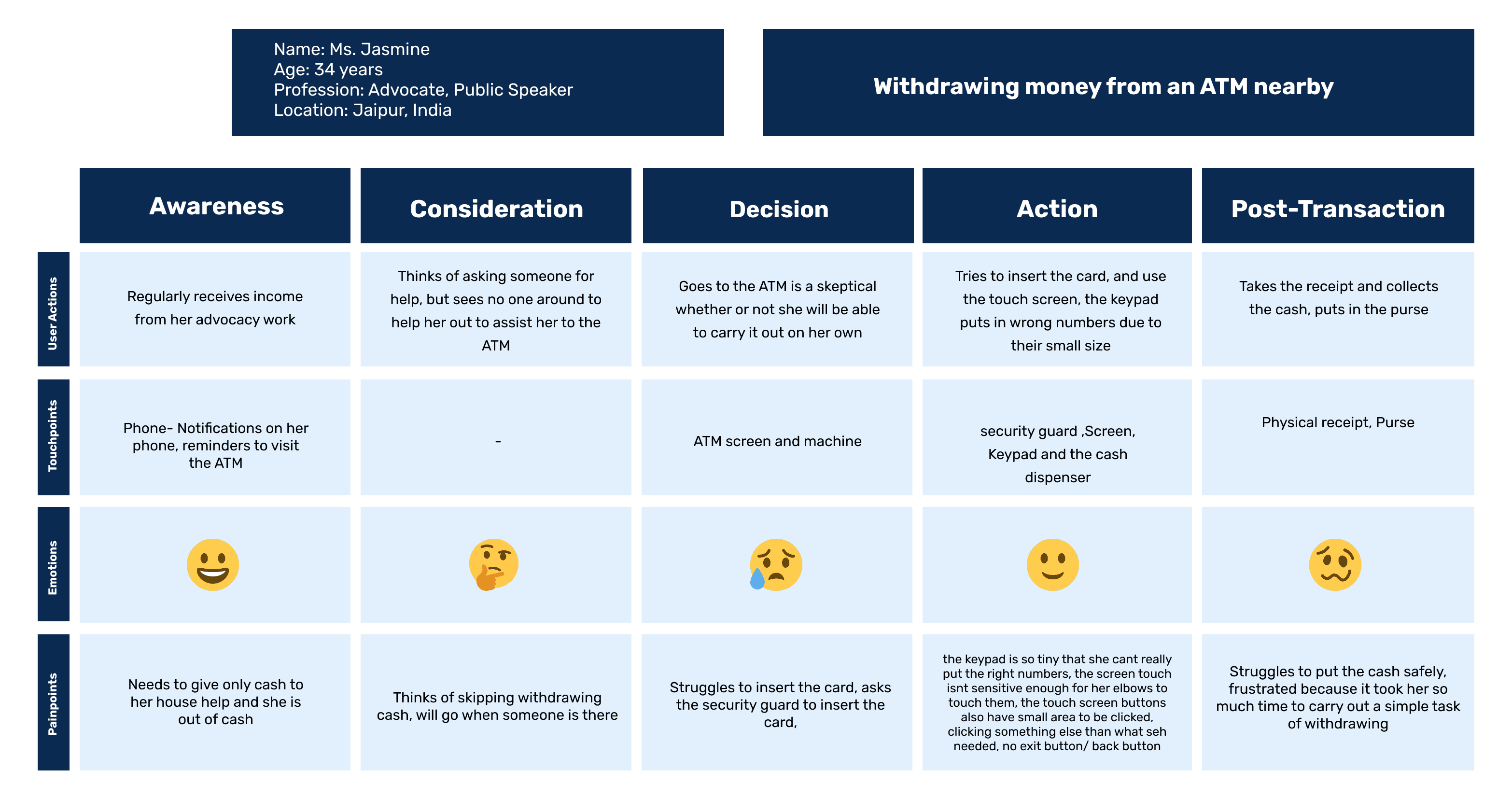
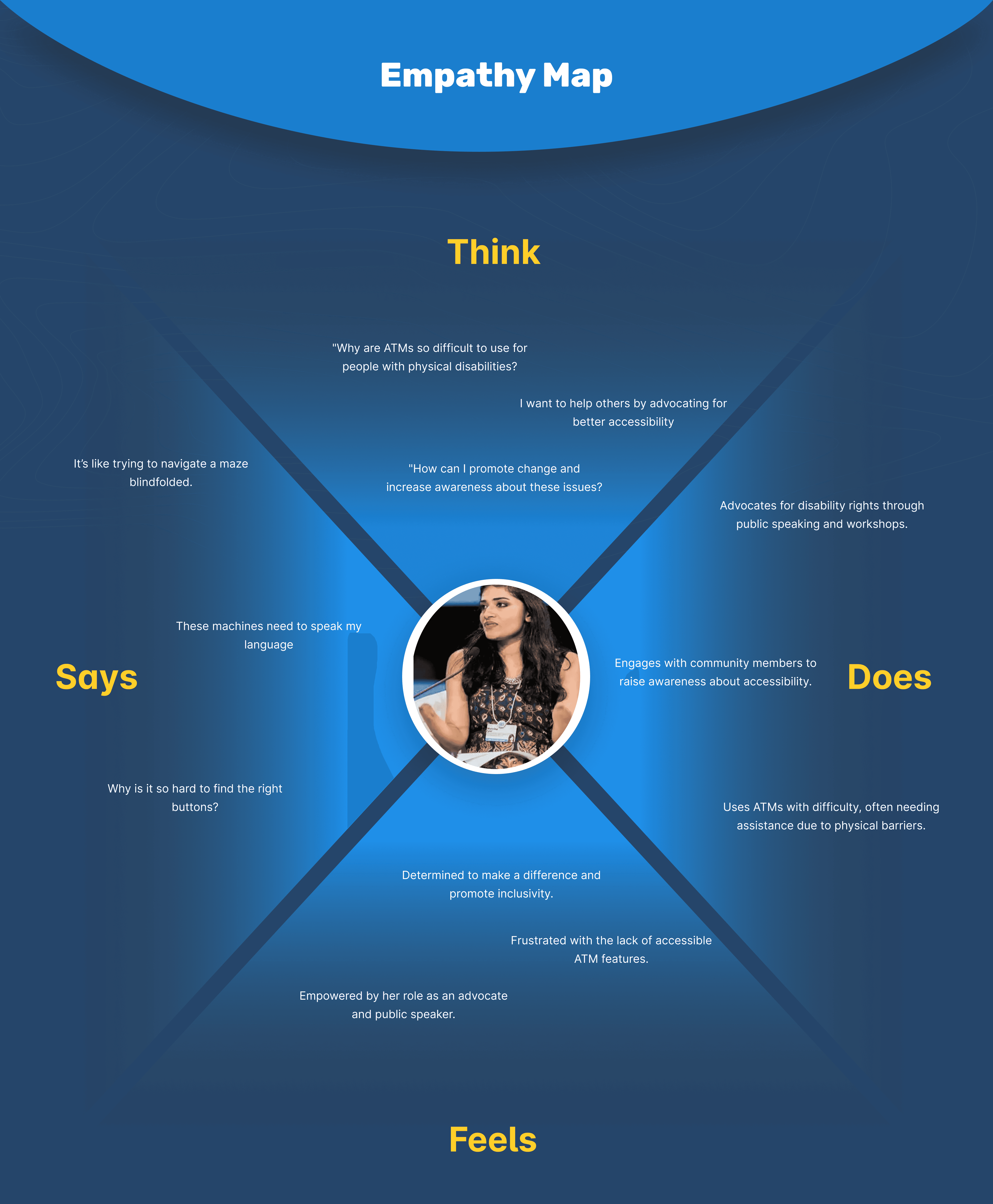
User Models: Personas, Empathy Maps & Journey Mapping
To guide inclusive design decisions, I developed composite user models for each of the three primary audience segments — elderly users, people with physical disabilities, and individuals with visual impairments.
For each user group, I created a:
Persona based on behavioral traits, needs, and constraints
Empathy Map to understand their mindset, motivations, and frustrations
Customer Journey Map highlighting their end-to-end ATM experience
These layered frameworks helped identify pain points at every stage, and revealed opportunities to design a more intuitive, independent, and humanized ATM interaction.
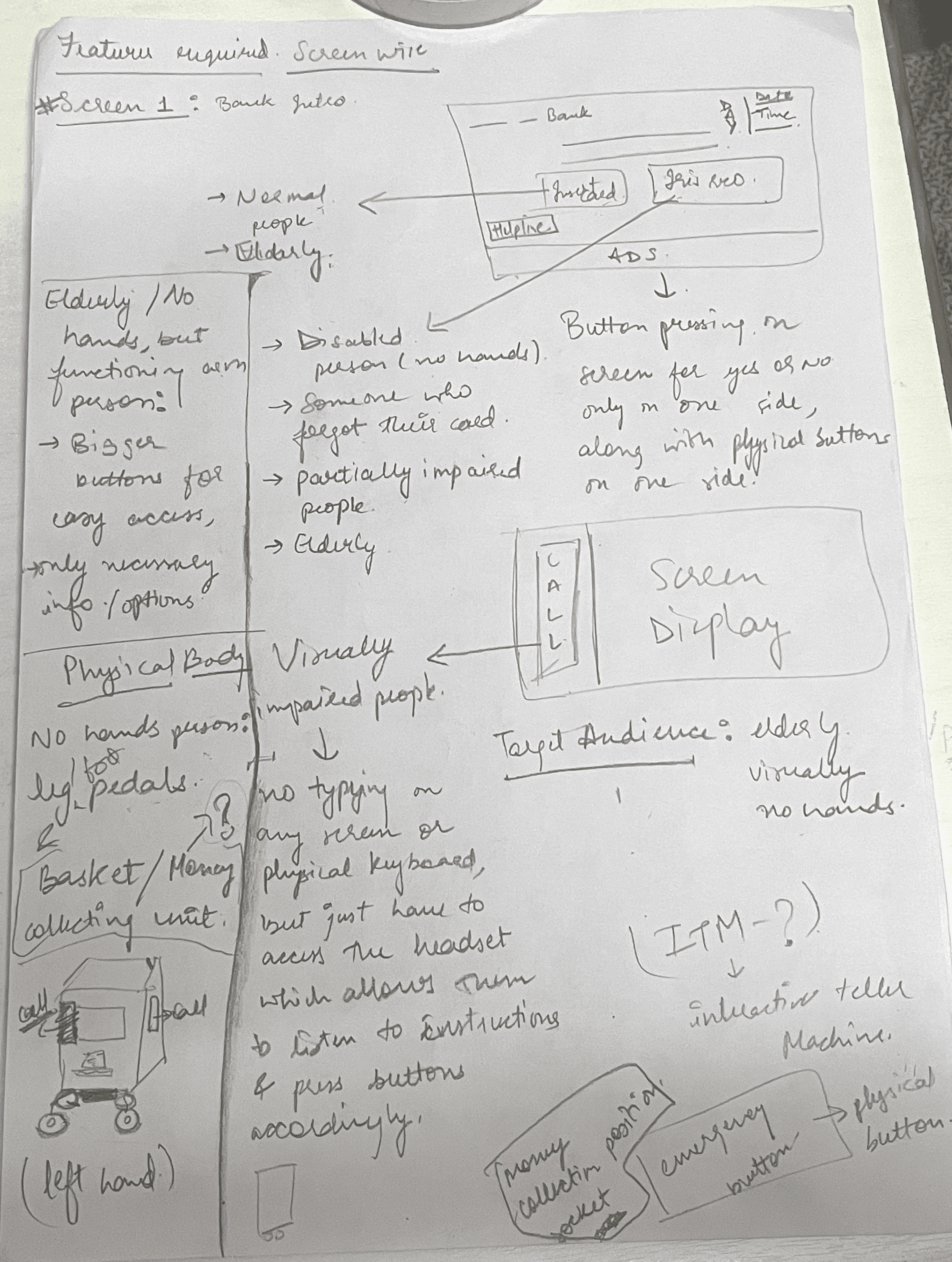
IDEATION
After synthesizing insights from research and user journey maps, I began brainstorming inclusive features for both the ATM interface and its physical form.
This stage was focused on quantity over perfection — thinking out loud through pen and paper before jumping into structure or screens.
The aim was to address user needs like voice assistance, tactile guidance, simplified flows, and improved accessibility through practical solutions.
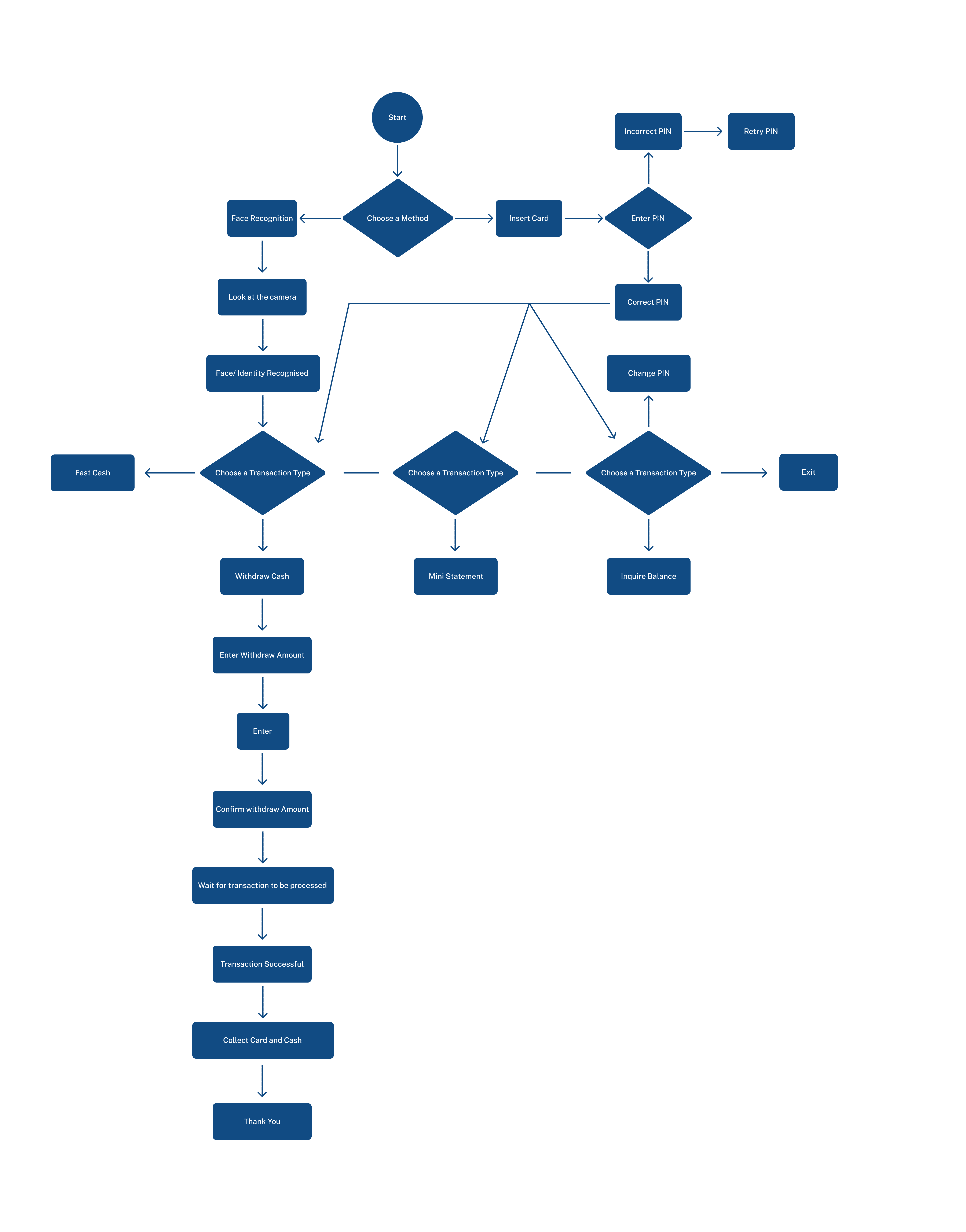
TASK FLOW
With key features defined, I mapped out a task flow to visualize how users would interact with the redesigned ATM system — from arrival to transaction completion.
This helped identify moments where users typically face friction and allowed me to restructure the experience to be more accessible, intuitive, and supportive across different abilities.
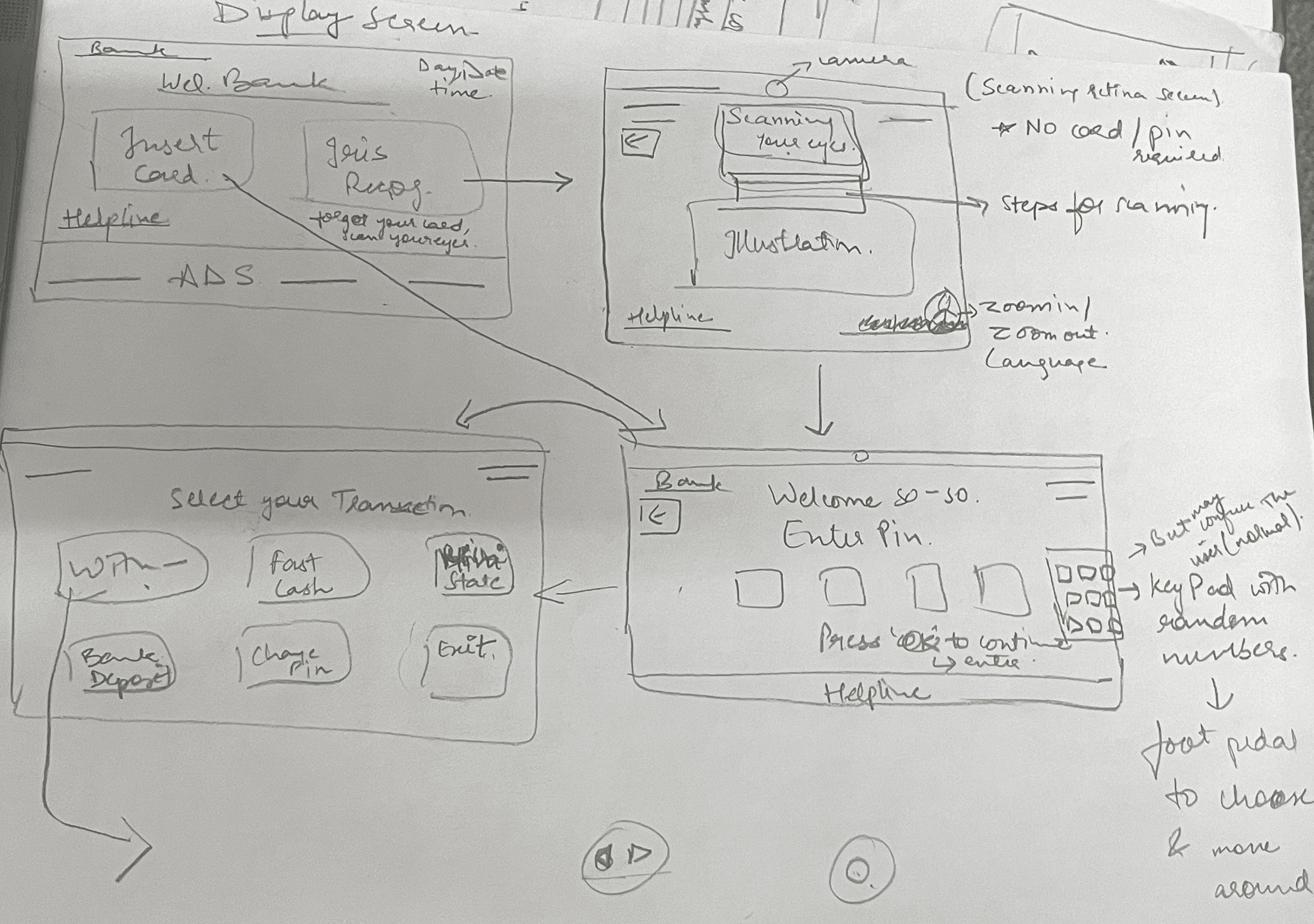
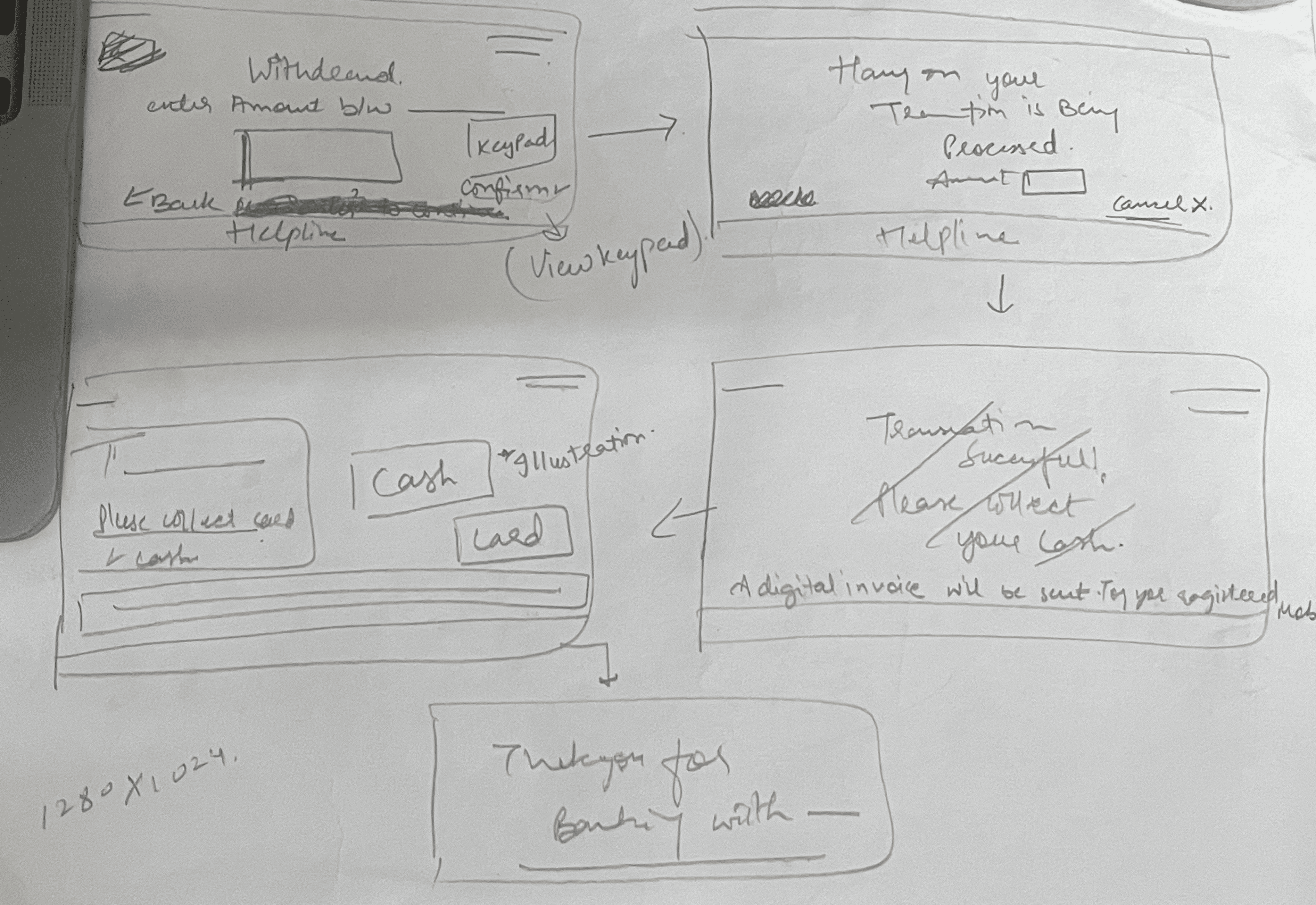
WIREFRAMES
Based on the refined task flow and user priorities, I developed wireframes to structure the core screens of the ATM interface.
These wireframes focused on accessibility-first elements like:
High visual contrast
Voice-guided prompts
Larger, readable typography
Minimal cognitive load
Each interaction was simplified to support independent use — especially for elderly users and those with vision or mobility challenges.
The wireframes also considered tactile feedback, screen pacing, and option clarity to minimize user stress and confusion.
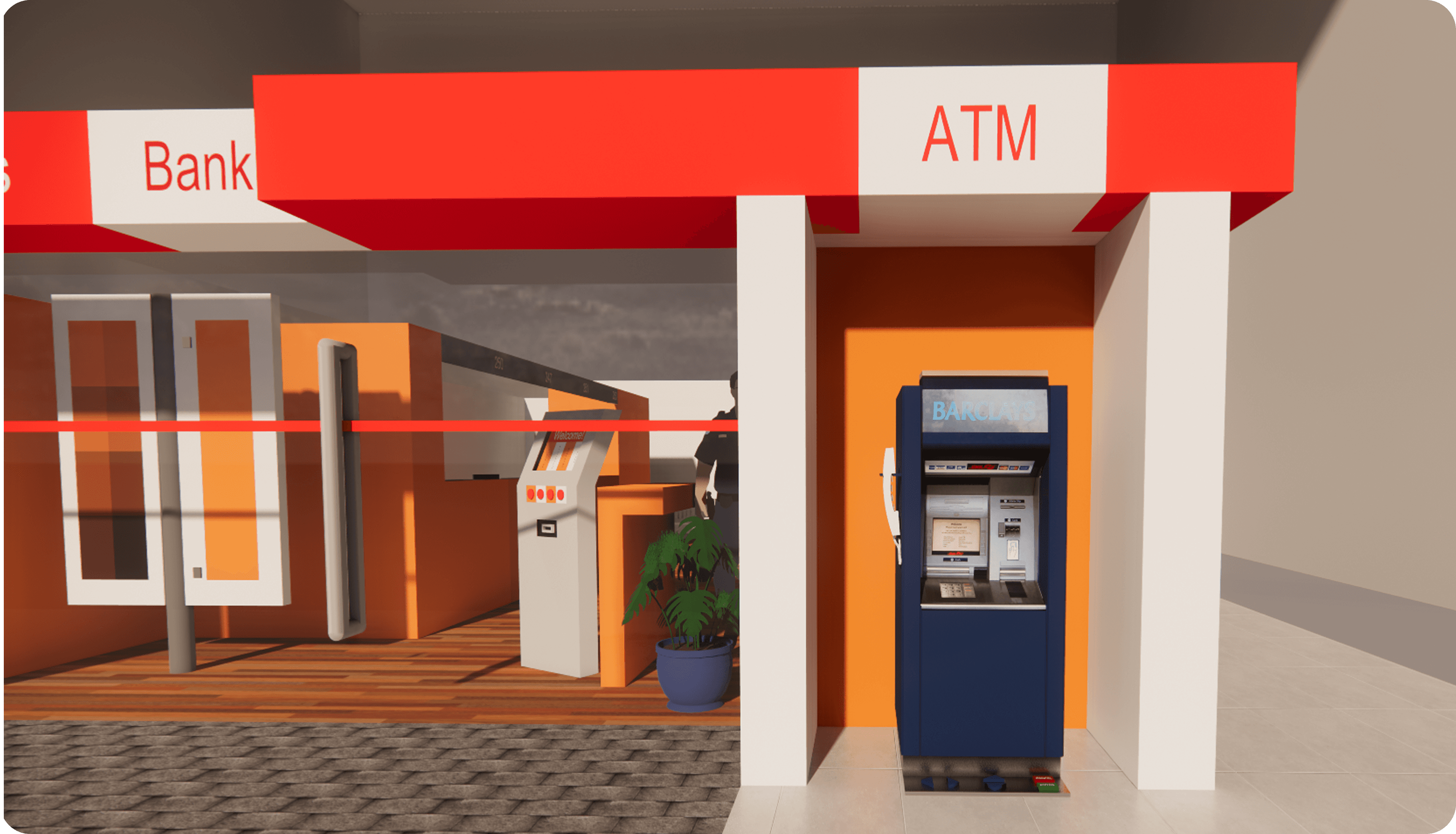
DESIGNING THE PHYSICAL EXPERIENCE
Accessibility isn’t just a UI concern — it extends to the physical interface too.
To address real-world usability challenges, I modeled a redesigned ATM unit that complements the inclusive interface with ergonomic enhancements and assistive features.
This 3D prototype was built using SketchUp and visualizes how space, form, and physical interaction can empower users with varying needs.
3D Model of the ATM
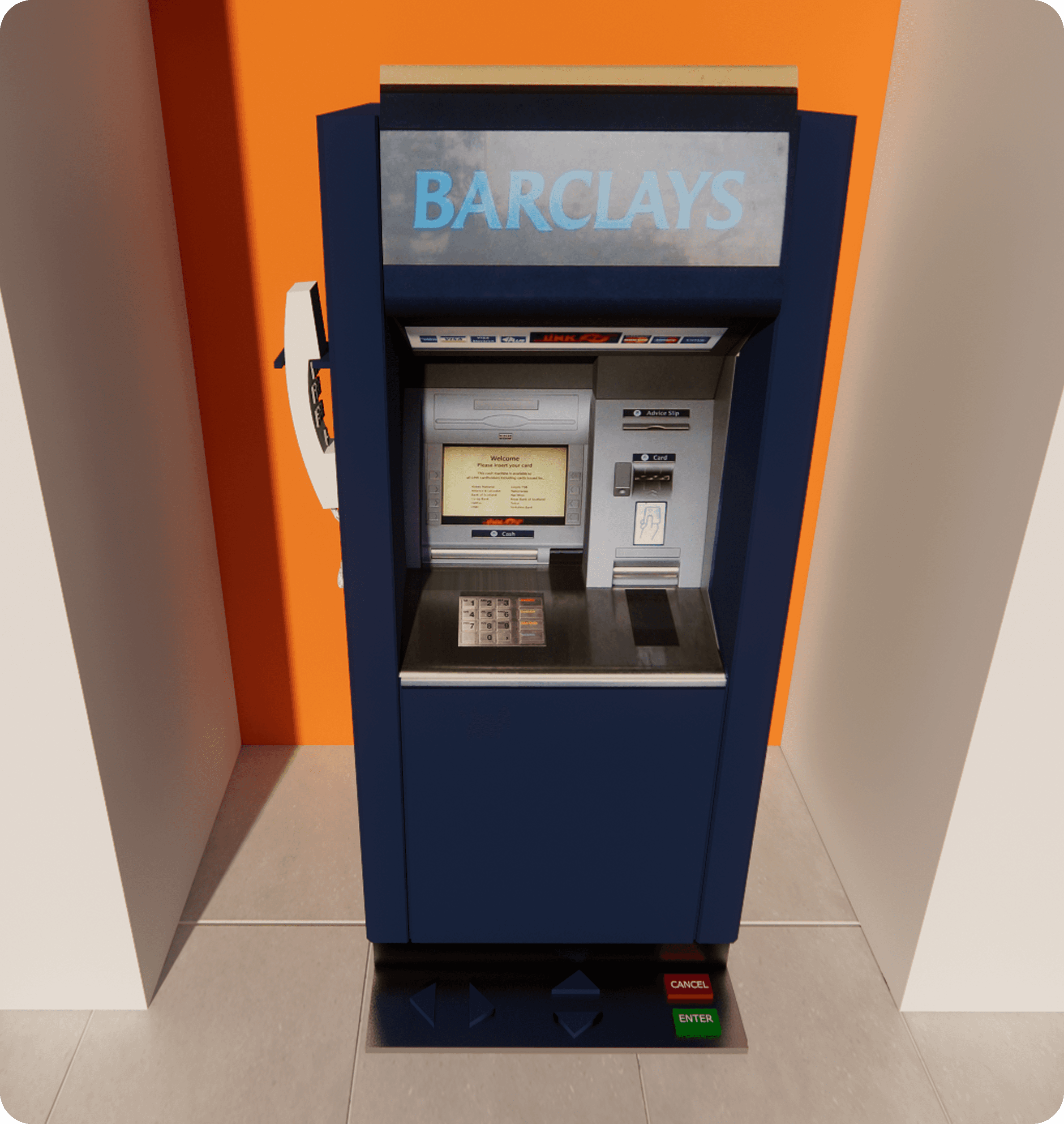
Key Enhancements:
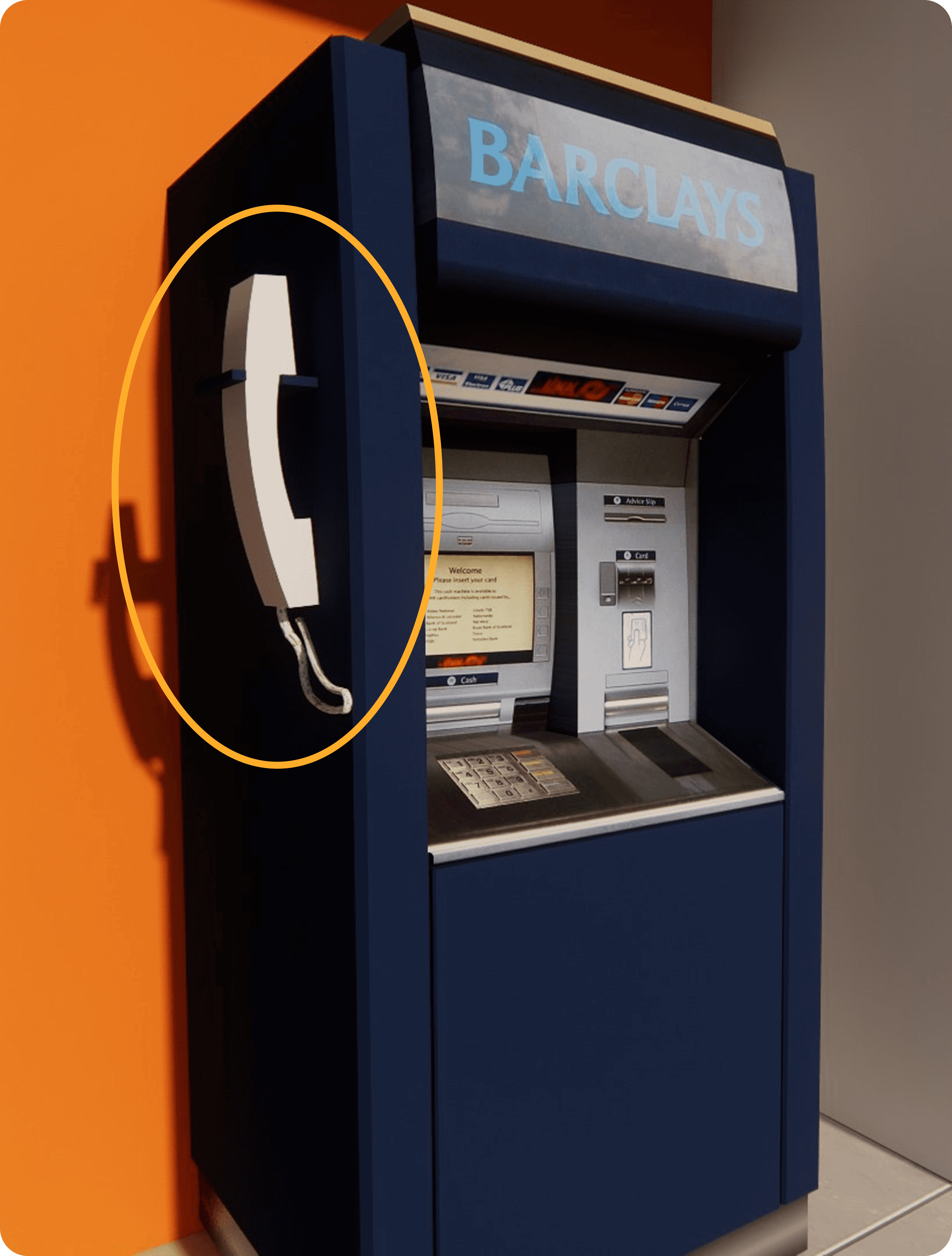
🔊 Headset Integration
Whether a user is fully blind, partially sighted, or has conditions like cataracts, they deserve an ATM experience that respects their privacy, autonomy, and safety.The proposed design includes:
A corded headset placed on the left-hand side of the ATM, mimicking the natural orientation used when handling traditional landline phones.
The headset features a dedicated keypad with both braille and printed numerals, accommodating users who may not be fluent in braille.
Users can listen to pre-recorded audio instructions that dynamically respond to their inputs, guiding them through each step — from PIN entry to transaction completion.
The keypad and headset design enables users to cover the entry pad with their free hand, ensuring privacy and security while entering sensitive information.
The cord is built using tamper-resistant materials, minimizing the risk of theft or vandalism.
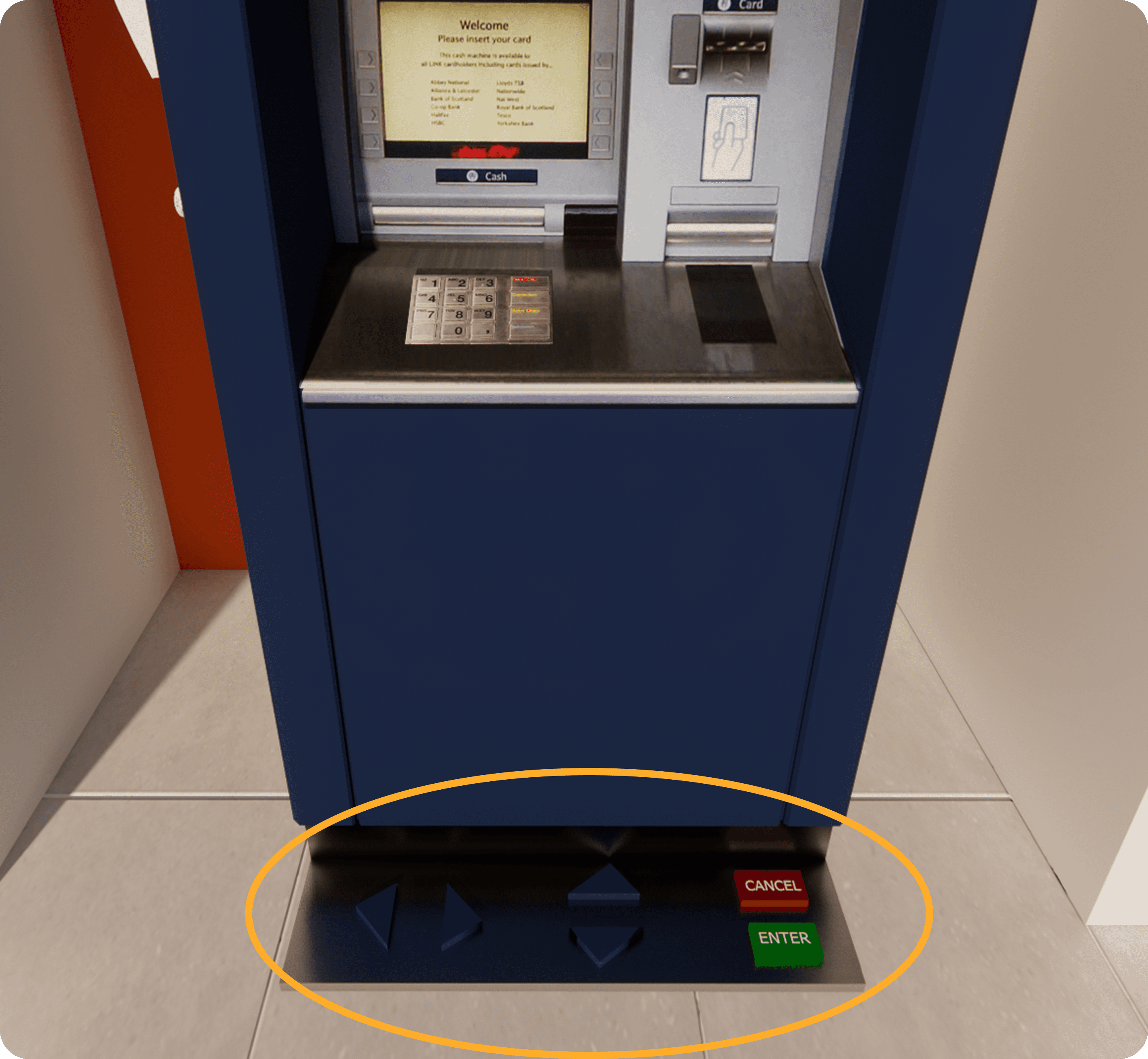
🦶 Foot Pedal Controls
One of the most overlooked user groups includes individuals with limb differences, temporary injuries, or hand mobility impairments. These users often depend entirely on others to complete ATM transactions — a stark contrast to the autonomy offered by UPI-based systems, which now allow small payments without PINs.
To address this gap, I introduced foot pedal controls that enable hands-free navigation:
Two directional pedals (inspired by gaming consoles) allow users to move left and right through on-screen options.
A third pedal acts as a confirmation/select button (e.g., "Enter").
A visual on-screen keypad highlights real-time selections, ensuring clarity and feedback for users.
This layout ensures ease of use, even for those unfamiliar with adaptive technologies, by relying on instinctive, spatial interactions.
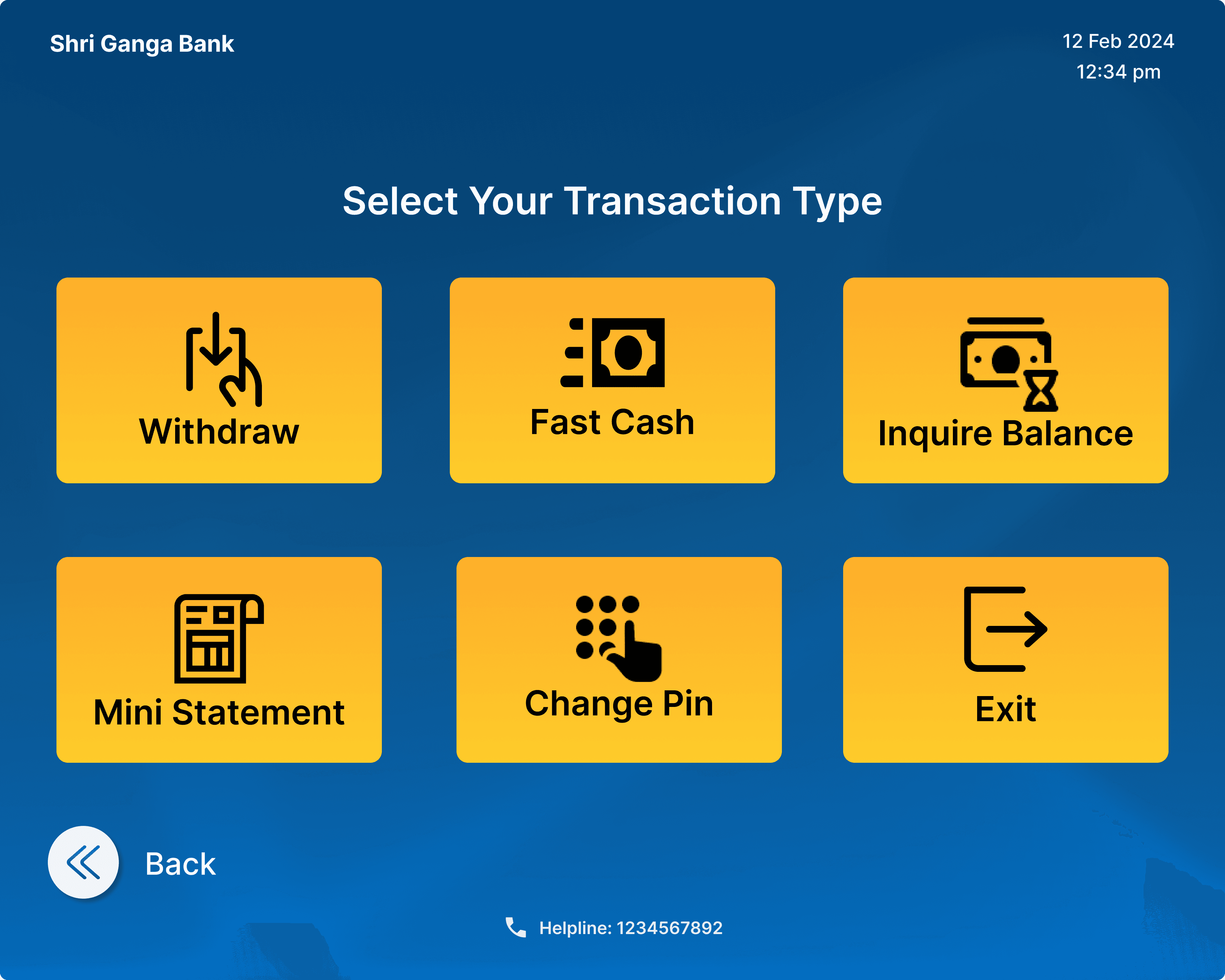
DESIGNING THE DIGITAL INTERFACE
While physical accessibility was a key focus, the on-screen experience needed to be equally intuitive — especially for the elderly and those unfamiliar with digital systems. This segment of users often faces anxiety during ATM interactions due to complex interfaces, small touch targets, and memory limitations.
The redesigned UI tackles these challenges with thoughtful, accessible solutions:
Larger, clearly labeled buttons to accommodate shaking or unsteady hands.
Essential options only, eliminating unnecessary clutter and reducing decision fatigue.
Visual aids and icons that support quick recognition and reinforce clarity.
Step-by-step on-screen cues to guide users throughout the transaction process with confidence.
Face or iris recognition as an alternative login method for users who may forget their card or PIN — offering both security and ease.
By simplifying the interface and building in error-proofing mechanisms, the design empowers elderly users to carry out transactions independently and with dignity.

Want to explore the full experience?
Click the link below to view the complete UI prototype and walk through the redesigned ATM journey yourself.